
Case Study
The Sandy Shop — Restaurant Branding
A playful brand identity for a food & drinks outlet.
Start your project →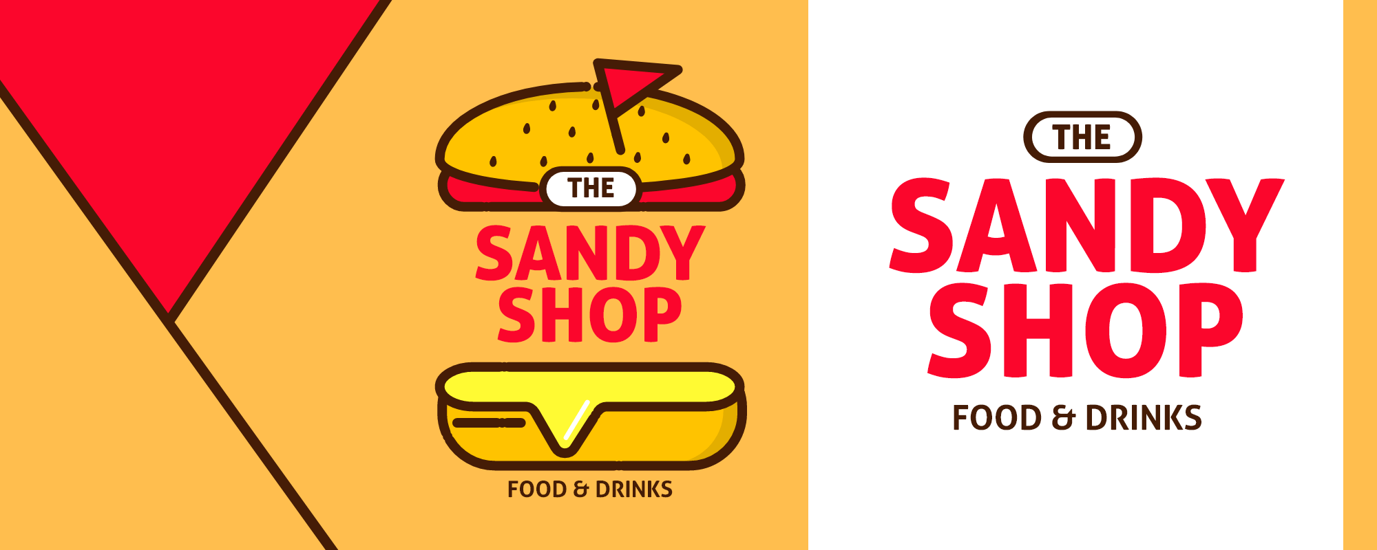
Overview
The Sandy Shop is a food and drinks outlet that needed an identity as appetising as its menu. We created a warm, playful brand built around a burger-inspired logomark, a bold red-and-yellow palette and a chunky, friendly typographic system. The identity is designed to feel instantly recognisable and fun, working just as well shrunk to a social avatar as it does blown up across a storefront.
The challenge
Opening in a crowded food market, The Sandy Shop had to look instantly appetising and memorable while avoiding the tired clichés of generic fast-food branding. The identity needed personality and warmth, but also the discipline to stay legible and consistent across very different applications — signage, packaging, menus and social — often at small sizes and on the move.
Our approach
We leaned into the product itself. Rather than a decorative mark, we explored a logo concept built from the food the shop serves, so customers understand it in a heartbeat and smile when they do. From there we developed a flexible system of lockups and rules, making sure the fun never came at the cost of clarity or consistency.
Identity design
The centrepiece is a playful burger-inspired logomark paired with a punchy red-and-yellow palette and a chunky, rounded display type. Every element is tuned for legibility and cheer, whether it appears as a tiny profile picture or a large exterior sign. The result feels handmade and approachable while still reading as a real, established brand.
Brand system & applications
We extended the mark into a complete, flexible system — primary and simplified lockups, colour rules and type styles — ready for signage, packaging, menus and social. With clear guidance for each context, the brand stays consistent wherever it appears and can grow with the business without losing its character.
Process & delivery
We explored a range of logo concepts before honing in on the burger-led idea, then refined the mark for balance and legibility at every size. From the final logo we built out the colour, type and lockup rules, testing them against real applications such as signage, packaging and social so the system was proven in context rather than theoretical.
Highlights
- Burger-inspired logomark
- Bold red and yellow palette
- Rounded display typography
- Primary and simplified lockups
- Signage and packaging-ready
- Social and avatar variants
The outcome
The finished identity makes The Sandy Shop feel established, inviting and unmistakable from day one. It is the kind of warm, characterful brand that customers remember and return to — punching well above the weight of a new, independent outlet.
Results & impact
The identity gives a new outlet the presence of an established brand. Its warmth and wit make it memorable, while the disciplined system keeps it consistent across every touchpoint a growing food business needs. The Sandy Shop now owns a flexible, recognisable look that customers respond to and return for, which is exactly what an independent brand needs to compete.
Frequently asked questions
What did Creative Alive create for The Sandy Shop?
We designed the full brand identity — a burger-inspired logomark, a colour and typography system, and lockups ready for signage, packaging, menus and social.
Is this a branding or a web design project?
The Sandy Shop was a branding and logo design project focused on visual identity rather than a website.
Can Creative Alive design a brand identity for my restaurant or food business?
Yes. We create logos, brand systems and packaging-ready identities for food, drink and hospitality businesses. Reach out to get started.
Project type: Branding / Logo Design • Platform: Brand Identity
Let’s build something great together
Tell us about your project and we’ll help you design, build and launch it.