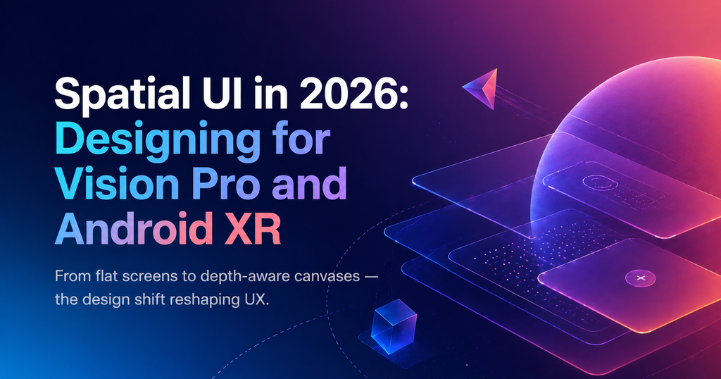
TL;DR — Spatial UI is not a separate platform anymore — it is an influence on every surface. Vision Pro and Android XR have normalized depth, glass, and gaze-driven interaction, and those principles are creeping back into web and mobile design. This guide covers the patterns worth stealing and the traps worth avoiding.
What is spatial UI?
Spatial UI is any interface that treats depth, parallax, and 3D placement as first-class design primitives. On a headset it is literal space. On a phone or monitor it is simulated depth through materials, shadows, and motion — and in 2026, every serious product uses some amount of it.
Why spatial design broke into mainstream UX in 2026
The hardware is shipping
Apple Vision Pro’s second generation hit 4M units in the last year. Android XR — Samsung’s Galaxy Ring AR line and Google’s reference platform — reached volume in Q2. With real user counts, design teams are shipping real apps instead of concept videos.
Flat design feels sterile
A decade of flat UI made every SaaS product look the same. Depth, glass materials, and subtle parallax have come back as a way to differentiate — and to carry tone the way motion did.
WebGPU and View Transitions normalized depth on the web
You no longer need a 3D engine to ship layered, depth-aware interfaces. `backdrop-filter`, layered compositing, and GPU-accelerated blur made glass materials a one-line CSS change. That lowered the cost of spatial aesthetics dramatically.
5 spatial patterns you can ship today
- Layered glass panels. Use `backdrop-filter: blur()` + subtle borders to communicate a floating element without a drop shadow.
- Gaze-aware focus. Hover is dead on touch and headset — design large, forgiving focus targets that grow subtly when entered.
- Depth tokens in the design system. Elevation as a named token (`depth/1` through `depth/4`) instead of ad-hoc shadows.
- Parallax for hierarchy, not decoration. Background drifts slower than foreground cards, reinforcing which element is primary.
- Spatial audio cues. Even on 2D screens, pairing a sound with a panel appearing from a direction gives the eye a hint to track it.
Traps and accessibility guardrails
Spatial aesthetics look great and fail badly. The two risks most teams underestimate:
- Motion sickness. Parallax at 60fps is fine. Parallax that stutters causes nausea. Respect `prefers-reduced-motion` — swap parallax for a cross-fade.
- Contrast collapse. Glass panels over busy backgrounds fail WCAG. Always include a solid-fallback mode and test with the background content turned off.
Frequently asked questions
Do I need a Vision Pro to design for spatial UI?
No. Most spatial patterns — glass materials, depth tokens, parallax — are web and mobile techniques you can test in a browser. A headset helps for native XR apps but is not required for 2D spatial influence.
Is spatial UI a trend or a permanent shift?
Permanent. The shift is less about headsets and more about depth becoming a standard design primitive, similar to how dark mode went from trend to default.
What replaces the traditional mouse hover in spatial UX?
Gaze-based focus on headsets, large forgiving tap targets on touch, and keyboard-style focus rings on desktop. The common rule: make focus state obvious, because hover can’t be assumed anymore.
Found this useful? Read Micro-Interactions in 2026: The New Rules of Motion UX for the companion guide on how motion reshaped product design this year.