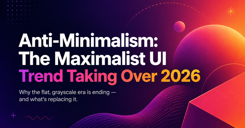
TL;DR — Minimalism is exhausted. A decade of flat, grayscale SaaS design made every product look like every other product. The 2026 response is expressive maximalism: bold type, texture, color, and a point of view. Here’s what it looks like in practice and where it’s working.
What is maximalist UI?
Maximalist UI uses visual intensity — bold typography, saturated color, texture, layered composition — as a brand differentiator. It is not “cluttered.” It is opinionated. Every element is dialed up, but chosen deliberately.
Why it swung back in 2026
Every SaaS looked the same
By 2024, you could not tell two B2B products apart at a glance. Gray, white space, a blue accent, a sans-serif. Maximalism is the visual reaction against that sea of sameness.
AI-generated design is generic by default
As AI-generated UI tools proliferated, the default output converged on a flat aesthetic. Strong, opinionated human design became a signal of care.
The audience matured
Early minimalism was about legibility for users new to software. In 2026, users are fluent — they don’t need the interface to apologize for existing. Expressive UI signals a confident brand.
The maximalist patterns working now
- Oversized typography. Headings at 120-200px, often variable and sometimes kinetic.
- Saturated, non-corporate color. Acid greens, hot pinks, oranges — ditched in 2012, welcomed back in 2026.
- Texture and grain. Paper, noise, subtle patterns — antidotes to pixel-perfect flatness.
- Asymmetric layouts. Grids break. Content overflows. Elements overlap. Confidence beats symmetry.
- Hand-drawn elements. Icons, illustrations, and even UI controls with human imperfection baked in.
Where maximalism works (and where it doesn’t)
Maximalism thrives in brand-forward products: creator tools, fintech landing pages, AI-native apps. It fails in:
- High-density dashboards and data-heavy interfaces — still minimalism’s home turf.
- Enterprise B2B where the buyer is more conservative than the end user.
- Anywhere accessibility lags — maximalism done wrong breaks contrast and readability faster than minimalism does.
Most products in 2026 live in a middle ground — minimalist core with maximalist marketing surfaces. That’s the realistic default, not full-bore maximalism everywhere.
Frequently asked questions
Is maximalism replacing minimalism entirely?
No. The two will coexist — minimalism for dense product surfaces, maximalism for brand, marketing, and landing experiences. The shift is that pure minimalism is no longer the default everywhere.
How do I start adding maximalist elements without breaking consistency?
Begin at the brand layer: typography, color, marketing site. Keep the product UI minimalist where density demands it. Expand gradually based on whether users respond.
Does maximalist UI hurt accessibility?
Not inherently. Bold type is often more legible; saturated color requires careful contrast checking; texture should never carry meaning without a text fallback. Done carefully, maximalism can improve accessibility.
Found this useful? Read Micro-Interactions in 2026: The New Rules of Motion UX for the companion guide on how motion reshaped product design this year.