TL;DR — In 2026, motion has become the primary layer that carries brand voice in UI, the work microcopy used to do alone. Spring physics, scroll-linked timelines, haptic-style feedback, and choreographed state transitions now set the feel of a product. Products that still treat motion as polish read as dated. This guide covers the five patterns defining motion UX this year, the tooling shipping them, and how to design motion without breaking accessibility or performance.
What is a “micro-interaction” in 2026?
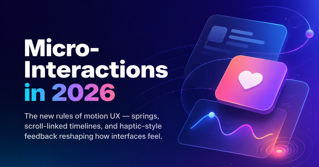
A micro-interaction is a small, self-contained moment of interface behavior — a button press, a toggle, a list reorder, a page transition. In 2026, those moments are the primary medium through which an interface communicates tone, trust, and personality. The rhythm of a spring, the weight of a modal, and the cadence of a scroll-reveal each say something about the brand before a user reads a single word.
Why motion replaced microcopy as the UX brand layer
Microcopy ruled interface voice for a decade. Empty-state messages, button labels, and toasts carried the brand’s personality in compact bursts of text. Three forces in the last two years made text insufficient on its own.
Users read less. AI answer engines and summarizers have trained people to skim. Hero headlines, buttons, and toasts get less attention than they used to — a paragraph of clever microcopy, however sharp, often goes unread.
Motion tooling finally caught up. Framer Motion, React Spring, GSAP’s modern builds, and native CSS @scroll-timeline / view-transitions have all reached production reliability. A designer can now ship a physics-based interaction in an afternoon instead of negotiating it for a sprint.
Devices got expressive. 120Hz displays, haptic engines, and GPU-accelerated compositing on phones and laptops mean designers can assume sub-16ms response times. Motion that stuttered in 2020 feels solid in 2026.
Put those together and the shift many teams are still catching up to comes into focus: the feel of a product is set by motion, and copy plays a supporting role.
The 5 micro-interaction patterns defining 2026
1. Spring physics on every tactile control
Linear and ease-out curves feel mechanical in 2026. Springs — configured with mass, stiffness, and damping — feel alive. Linear’s command bar, Raycast’s launcher, and Arc’s tab animations all use spring-based motion with slight overshoot on entry and a gentle settle on exit. Switching from springs back to cubic-bezier easing now reads as “older product.”
2. Scroll-linked timelines via CSS @scroll-timeline
Scroll-driven animations used to require IntersectionObserver and manual JS orchestration. scroll-timeline and view-timeline in modern CSS let designers choreograph hero sections, section transitions, and progress indicators without any JavaScript. Apple’s product landers and Stripe’s docs use this pattern to narrate a story as you scroll.
3. Haptic-style visual feedback on the web
The web can’t trigger true haptics, but designers are simulating the feel visually: a 120ms scale-down-and-back on button press, a brief color shift on list reorder, a “thunk” weight on drag-release. It’s a language borrowed from iOS 18+ and Material You that now reads as the default on the web.
4. Choreographed state transitions (not page loads)
SPAs used to swap screens with a fade. In 2026, the expectation is choreographed transitions — elements that morph, share layout, and animate between states. The View Transitions API has gone from experimental to production-ready, and shared-element transitions now do the heavy lifting that “loading…” copy used to carry.
5. Generative, content-reactive motion
This is the frontier — motion that adapts to data. Charts that breathe in response to streaming updates. Lists that pulse when new items arrive. AI-output surfaces that use token-streaming rhythm to communicate that a model is “thinking.” Perplexity, Linear’s AI panel, and ChatGPT’s voice interface all use motion to express process state that copy can’t convey in real time.
How motion became a brand layer, not decoration
In 2018, most teams treated motion as polish — a final step added after the product worked. Today, motion is specified at the design-token level alongside color and typography. Spring constants for a button, duration and curve of a modal, and the rhythm of a page transition are documented, versioned, and audited the same way type ramps are.
What it means for motion to be a brand layer:
- Consistency across the product. The same spring configuration drives every tap, every toggle, every sheet. Inconsistency reads as sloppy, the way mismatched typography used to.
- Tone encoded in physics. A playful brand uses higher stiffness and overshoot. A serious enterprise brand uses critically damped springs that settle without bounce. The physics carries the personality.
- Motion in the design system. Figma libraries ship motion specs as named tokens (
motion/spring/tap,motion/duration/modal). Engineers consume them the same way they consume color tokens.
Without this level of formalization, motion feels accidental — and accidental motion is exactly what makes a product feel unfinished.
The motion toolkit shipping in 2026
The tooling matters because it decides what is cheap enough to ship.
- Framer Motion — the dominant React library for product motion. Layout animations and shared-element transitions are its headline features.
- React Spring — physics-first, lower-level, preferred by teams wanting fine control over springs and gestures.
- GSAP 4 — the choice for complex, timeline-heavy marketing sites and scroll-driven storytelling.
- Native CSS —
@scroll-timeline,view-transition, and Houdini animation worklets now cover a surprising amount of the previously JS-only territory. - Rive — interactive animations shipped as a runtime (state machines, not prerendered), used for illustrations that react to input.
- Lottie — still everywhere for one-shot animations, losing ground to Rive for anything interactive.
Practical default stack for most product teams in 2026: Framer Motion for app UI, native CSS scroll-timelines for marketing pages, and Rive for hero illustrations.
Designing motion without breaking accessibility or performance
Respect prefers-reduced-motion
Roughly 35% of users have some degree of motion sensitivity; a non-trivial fraction set prefers-reduced-motion: reduce at the OS level. Every motion pattern in your system needs a reduced variant — typically a crossfade or an instant state change. This is not optional; it is the minimum bar for shipping motion.
Budget motion against the main thread
60fps means you have 16.6ms per frame. Scroll-linked animations run on the compositor for free, but JS-driven layout, shadows, and filters do not. Measure. Use will-change sparingly. Animate transform and opacity, not box-shadow, width, or height. If you can’t hit 60fps on mid-tier Android, simplify the motion — don’t ship it “hoping it’ll be fine.”
Don’t replace copy you actually need
Motion communicates tone well. It communicates specifics badly. If a user needs to understand why an action was blocked, a toast with clear copy beats a red shake every time. The working rule: motion for mood, copy for meaning. Mix them.
Key takeaways
- Motion is the primary brand layer of 2026 UI — teams treating it as polish are shipping dated-feeling products.
- Five patterns dominate: spring physics, scroll-linked timelines, haptic-style feedback, choreographed state transitions, and generative content-reactive motion.
- Formalize motion in your design system with tokens, specs, and documentation — the way you do type and color.
- Respect
prefers-reduced-motionand budget motion against the main thread. - Motion replaces the tone work microcopy used to do. Microcopy still owns meaning. Use both.
Frequently asked questions
Is motion-heavy UI bad for accessibility?
Only if you don’t support prefers-reduced-motion. Every motion pattern should have a reduced variant (typically a crossfade or an instant state change). With that in place, motion-heavy UI is fully accessible.
What’s replacing cubic-bezier easing in 2026?
Spring physics. Springs defined by mass, stiffness, and damping feel more natural than duration-based easing curves, and they are now supported natively in CSS (animation-timing-function: linear(...)) and in every major motion library.
Should small teams invest in a motion design system?
Yes — but start small. Three or four motion tokens (tap, modal, page-transition, toast) cover roughly 80% of the product surface. Document them, use them everywhere, and expand when a real need appears.
Is scroll-driven animation good or bad for SEO?
Neutral to positive. Scroll-linked CSS animations don’t block rendering, and when paired with content-visibility and sensible fallbacks, they have no negative impact on Core Web Vitals. Google ranks on LCP, CLS, and INP — motion done right improves INP by making interfaces feel more responsive.
How is motion design different from animation?
Animation is the broader craft. Motion design in UI specifically means interface behavior — how elements move in response to user action, state, or data. It is functional animation, not decorative.