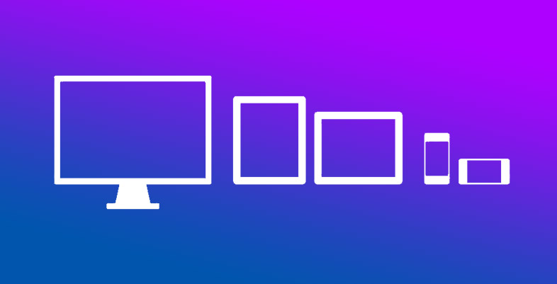
You have nowhere to run! Most customers nowadays when they think about building a website already want it to be accessed by the cell phone, tablet and other various devices that we have out there. And they are right in this desire, because the projection of cell phones in use in increasing frequently worldwide.
That’s where responsive design comes as an important concept when thinking about building websites for different devices and screen resolutions. If you are a frequent reader of the blog, you probably already have a previous knowledge about it.
This article entails the famous media queries that assign different CSS styles to different screen resolutions, thus providing a different look with each resolution detected.
So? Ready to start? Let’s Go!
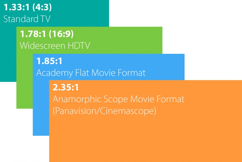 Source: http://www.cedia.org/files/image/aspect-ratios.jpg
First Step – Media Types
The question of thinking responsive design is not just about screen resolutions. Even before the half-queries came up, there is an effort to enable us to offer responsive styles to suit devices such as the printer. Its specification defines CSS for some types of devices like Braille, PowerPoint presentations, printers, among others stated below:
- All
Suitable for all devices.
- Braille
Intended for Braille tactile feedback devices.
- Embossed
Intended for paged Braille printers.
- Handheld
Intended for handheld devices (typically small screen, limited bandwidth). - Print
Intended for paged material and for documents viewed on screen in print preview mode. - Projection
Intended for projected presentations, for example projectors. - Screen
Intended primarily for color computer screens. - Speech
Intended for speech synthesizers. Note: CSS2 had a similar media type called ‘aural’ for this purpose.
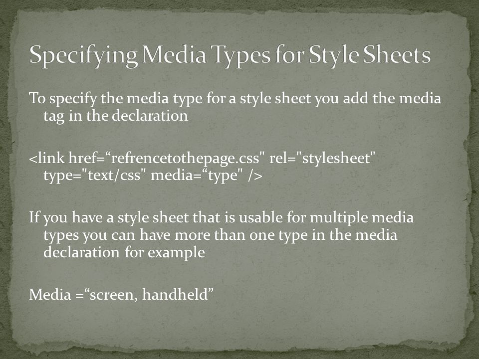 Source: http://images.slideplayer.com/36/10651399/slides/slide_3.jpg
You can simply create a specific sheet for the print and in the “media” attribute inside the HTML link tag put the “print” value.
Despite the aforementioned types of averages, the technology used in devices with internet access evolves very fast and dozens of new types of mobile phones, tablets and TVs increasingly colorful and differentiated come up at all times.
Many of these devices are small in size but have the same, perhaps better, resolutions of a PC. It seems confusing because we cannot use a media type for handheld device since it does not fit the type, much less screen since it is for desktops.
Evolution – Media Queries
Media Queries uses a logical expression to check the types of devices covered by media types and also their capacity. The logical expression queries the device that the user is using to access the site and check parameters such as screen resolution, height and browser width, among other things. From here you can specify the desired style according to the parameter of the consulted device. But how to proceed?
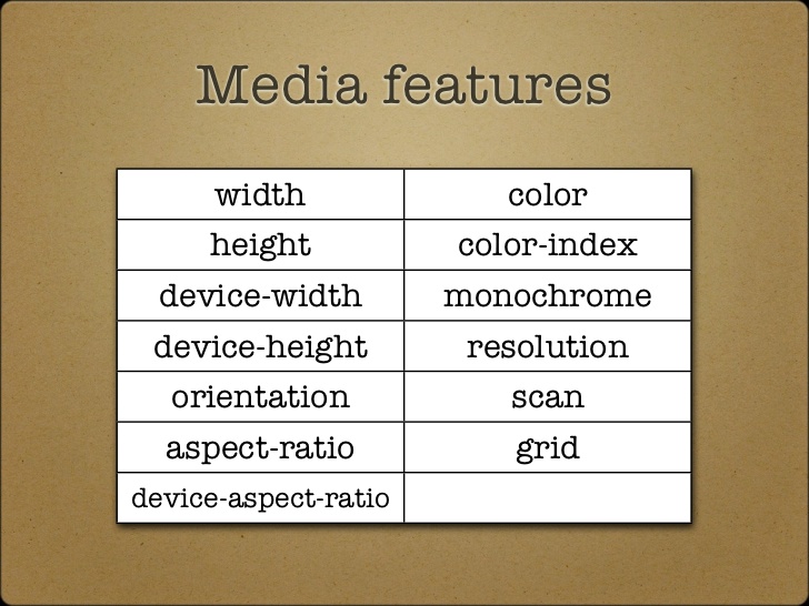
There is a list of parameters that you can use to select the devices you want. Look:
- Aspect-ratio;
- Color;
- Color-index;
- Device-aspect-ratio;
- Device-height;
- Device-width;
- Grid;
- Height;
- Monochrome;
- Orientation;
- Resolution;
- Scan;
- Width;
To perform a media query, it is necessary to use one or a set of these parameters to logically specify the desired styles.
 Source: https://www.slideshare.net/chrisdavidmills/the-web-standards-gentleman-a-matter-of-evolving-standards
Breakpoints
Breakpoints are “breaking points” where you determine the widths that the developer wants to make a query through half queries. To do this, simply know the resolution of a device, which is the width and height in pixels, and from the value of the width it specifies as the value of the breakpoint. There are some values widely used by developers, but it is not an absolute rule since there are thousands of devices and these values, of course, do not cover all.
Content-driven breakpoints
You should use the “content-driven breakpoints” that would find the half queries from the content and design of the site. In the process, it uses flexible in units and percentage resizing the browser until it is noticed that something in the layout is not legal. As a result, breakpoints will be based on the content and design of a site, not on default values that do not serve all devices. This is the best way to think and act so that a site meets different screen resolutions.
Testing
Once you have developed the responsive design, you will need to know if everything is really working for a good range of existing devices, right. There are some online emulator tools that simulate the look and feel of your website on different devices and resolutions. You can also use browserextensions. Google Chorme and Mozilla Firefox have advanced tools for checking resolutions.
With this article, you already have a good introductory basis for tinkering with CSS3 stockings queries. Currently the vast majority of browsers support, so you can start now. All you need is to have is an experienced web development company in Dubai, a good knowledge of CSS and keep in mind all the concepts of responsive design.
There is no more room for fixed sites that do not work well on mobile phones. Thinking about responsive design is thinking about the user experience. The use of half queries is allied with those who want to provide the best user experience.
Author Bio:
Sarah Feldman has years of experience in the digital marketing sectors and content writing. She has worked for several companies of Europe, America, UK, and Middle East. She is currently working as Blogger and Digital Marketing Expert in a web design agency in Dubai named as Digital Express.
5 replies on “How To Use CSS3 Media Queries So That Your Site Meets Different Screen Resolutions”
Hurrah, that’s what I was exploring for, what a information! existing here at this blog, thanks admin of this site.
This piece of writing presents clear idea designed for the new viewers of blogging, that genuinely how to
do blogging and site-building.
I pay a quick visit everyday a few websites and blogs to read posts,
however this weblog presents feature based content.
I believe what you posted was very reasonable. But, what about this?
what if you were to write a awesome headline? I am not suggesting your content is not solid., but
what if you added a post title that grabbed people’s attention? I mean How To Use
CSS3 Media Queries So That Your Site Meets
Different Screen Resolutions – Creative Alive is kinda vanilla.
You could peek at Yahoo’s front page and note how they create
news titles to grab people to click. You might try adding a
video or a related picture or two to grab people
excited about everything’ve got to say. Just my opinion,
it might bring your posts a little livelier.
Excellent article. I absolutely appreciate this site.
Thanks!