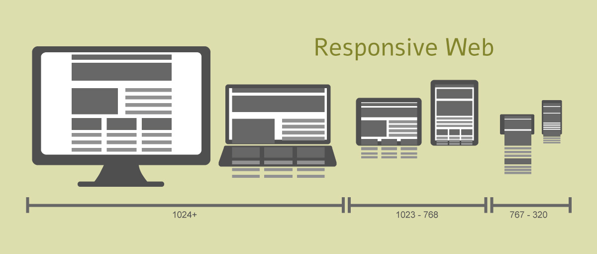
Responsive web has become the next big thing in the realm of website design. We have moved beyond the desktop and finally reached to the point where every client wants their websites to be optimized for mobile users. Being a newer approach in the web design, it helps designers and developers to build and maintain a single website to serve all kinds of devices in the most seamless manner.

Mobile adoption is increasing at an incredible speed, so as the diversity of mobile devices in the market. It is this multi-device environment that’s contributing to the share and profile for responsive web design simply because it offers a pleasurable viewing experience to the users. However, some companies are still slow to invest their time and money on responsive websites that render perfectly irrespective of the device being used.
In this post, we are going to discuss about the importance of responsive websites and why you need to prioritize it in your business. So, without further ado, let’s discuss them in detail.
1. Increasing Mobile Usage
The latest reports shown by Google have clearly stated that 90% of the people switch from one device to another to accomplish their browsing goals. Mobile trend indeed has skyrocketed and there are a myriad of surveys which have proved this fact.
- 25% of the people perform searches through their mobile devices only.
- 56% of the US adults own Smartphones, and out of 4 billion mobile phones in the world, 1.8 billion are Smartphones.
- 67% of the people claim that they are more likely to do online shopping through their Smartphones rather than the desktop.
- Around 5 million people will use Smartphones by the year 2017.
That’s the reason why responsive web design is ascending. It’s the only durable and no doubt a future-proof approach of building websites to beat the cut-throat multi-screen competition.
2. Users Demand a Seamless Experience of Website Viewing on Multiple Devices
A significant benefit of using responsive websites is that they are capable of providing a pleasurable experience across a myriad of devices. Instead of creating a different websites for the mobile users, designers can focus on creating a single website that runs smoothly on multiple devices. There is absolutely no compromise in the quality of images and content being delivered to the customers. In fact they look much matter and sophisticated as compared to the traditional websites.
3. Easy to Manage
It is difficult to manage SEOs of a website which have different versions for mobile and desktop as compared to the responsive design, which has only a single URL so managing SEO campaign is much better and faster. This would also lessen the efforts of your SEO and content marketing managers as they only have to focus on a single URL and update the keywords and content accordingly.
4. Ensures Lasting Business Benefits
A responsive website provides unprecedented opportunities for businesses to stay in front of consumers at every step of their online journey. People looking for websites, first read content and view videos from their desktop during work, and then look for the same website during free hours on their Smartphones or mobile devices to continue their search uninterruptedly.
On the contrary, if a business still runs a traditional or a mobile website, when the customer search for the information on a different device can become frustrated by finding the broken content or inability to navigate through the website completely.
5. A Delightful User-experience
Since, a responsive website provides continuity between different viewing, while remaining completely oblivious of the type of device and screen it has, the design wins the heart of its users by providing a memorable browsing experience. Plus, there is no need to waste time for the users to zoom, shrink, or pinch their screen to view something. A comprehensive reading and intelligent navigation drastically improve the experience, and make customers feel more connected with the website.
Wrapping Up
Responsive websites are a must have. They improve mobile marketing and SEO. Therefore, instead of developing different websites businesses should focus on creating responsive websites that can easily take the unified approach of presenting web content in the most engaging and satisfying way.
Author Bio: Maria Mincey is a productive author, who brings to the table a quantum of information around web improvement administrations. She works for Xicom Technologies, a offshore web development company which conveys most complete web applications and answers for diverse industry verticals.