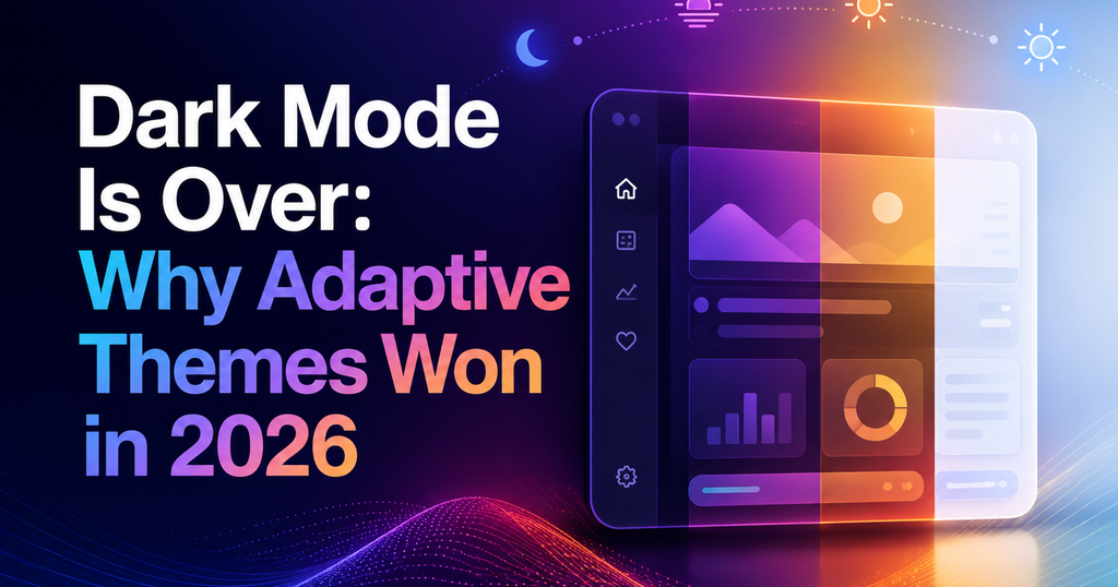
TL;DR — Dark mode as a binary toggle is being replaced in 2026 by adaptive theming — themes that respond to ambient light, time of day, and user context automatically. The UX upside is significant: less eyestrain, better legibility, and theming that actually matches where the user is.
What is adaptive theming?
Adaptive theming means the app’s color scheme changes continuously rather than switching between two fixed states. It may be keyed to OS settings, time, ambient-light sensor data, or deliberately user-controlled on a slider. The key shift: theming is no longer a toggle, it is a gradient.
Why dark mode alone fell short
One mode never fits everywhere
A user on a sunlit patio wants a higher-contrast light theme than a user on a subway. A binary toggle forces them into the wrong mode half the time.
Accessibility needs granularity
Users with photophobia, low vision, or astigmatism need fine-grained contrast control. Dark/light doesn’t reach them. A slider does.
Designers over-indexed on dark mode
Dark-mode design got most of the attention in 2020-2023. Light-mode counterparts stagnated. Adaptive theming rebalances effort and produces better results at both ends of the spectrum.
How to ship adaptive theming
Adaptive theming is mostly a tokens problem. Three-layer token architecture:
- Primitive tokens — raw values (`gray-50`, `gray-900`).
- Semantic tokens — role-based (`background/surface`, `text/primary`).
- Adaptive bindings — semantic tokens resolve to different primitives based on environment (system dark mode, ambient light via `prefers-contrast`, user override).
In CSS, `light-dark()` in 2026 is broadly supported, and `@media (prefers-contrast)` lets you ship a high-contrast adaptive variant alongside the default.
Patterns to adopt
- Auto + override. Detect OS preference, allow user override, persist the override per account (not just per device).
- Contrast slider. A single contrast dial (low-medium-high-maximum) covers 90% of accessibility needs.
- Time-of-day keying. For content-heavy apps, shift theme subtly over the day — warmer at night, cooler in morning. Subtle is key; no one wants a disco.
Frequently asked questions
Should I stop offering a dark-mode toggle?
No — keep it as one of the presets. But make it part of a broader theming system rather than the only axis of customization.
Is `light-dark()` in CSS widely supported in 2026?
Yes — all major browsers shipped it by 2025. It is a safe production default, with a `color-scheme: light dark` fallback for older browsers.
How granular should a user-facing contrast slider be?
Four steps is the sweet spot: Standard, Higher, High, Maximum. Five or more looks impressive in demos and confuses users in practice.
Found this useful? Read Micro-Interactions in 2026: The New Rules of Motion UX for the companion guide on how motion reshaped product design this year.