TL;DR — Color in 2026 is layered and expressive, not flat and muted. Mesh gradients, lumen highlights, and sophisticated duotones have replaced 2020’s pastels. This guide covers the palettes working now, the tools generating them, and the accessibility rules that keep them shippable.
What changed about color in 2026
Three shifts are reshaping how designers use color: wide-gamut displays made P3 the new default, CSS now supports real color interpolation (`color-mix`, `oklch`), and AI tools made generating and testing palettes nearly free. Together, those unlocked color work that was too expensive to ship five years ago.
The three dominant trends
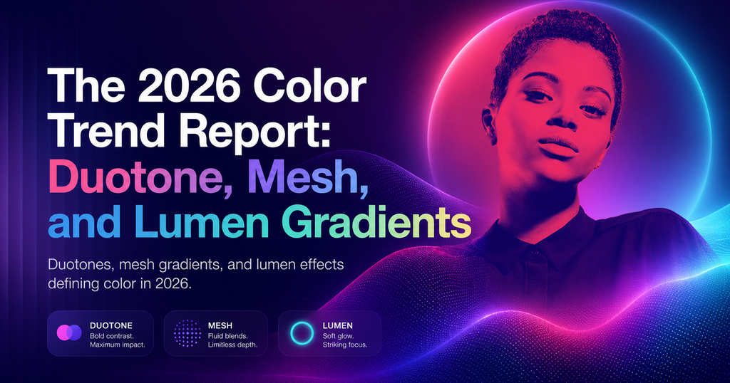
1. Duotone with a twist
Classic duotone is two colors; 2026 duotone adds a third accent used sparingly, typically in the 1-3% range of the composition. Think a teal+purple primary with a single hot-pink highlight. Visual rhythm without breaking the palette.
2. Mesh gradients
Multi-point gradients that do not follow a straight line. Now trivial in CSS Houdini and Figma. Used for hero backgrounds, card fills, and brand illustration. Linear, Vercel, and Raycast all ship mesh-gradient hero art.
3. Lumen effects
A soft glow behind UI elements that simulates panel-emitted light — directional, colored, subtle. Different from a drop shadow: lumen suggests the element is generating light, not casting it. Apple’s 2026 design language leaned on this heavily.
Palettes working in 2026
- Electric Twilight. Deep indigo, cyan, hot magenta accent. Default for AI-native tools.
- Warm Grit. Clay, terracotta, olive, cream. Creator tools, indie SaaS.
- Cool Mineral. Slate, ice blue, copper accent. Enterprise and fintech that want modern-without-shouting.
- Neon Forest. Deep green, lime, warm yellow. Climate and health products.
- Monochrome Plus. Grayscale base with one saturated accent color used at 5% frequency.
Accessibility in the new color era
The freedom to use more color brings more ways to fail accessibility. Three rules:
- Always check contrast against the darkest point of a gradient, not the average.
- Use OKLCH for programmatic contrast checks — sRGB math underreports issues on wide-gamut screens.
- Run the interface once in grayscale. If it becomes unusable, color is carrying meaning that it shouldn’t be.
Frequently asked questions
Are pastels dead in 2026?
Not entirely — pastels moved down-market into budget and wellness apps. In premium UI, saturated and moody palettes dominate.
What tools are designers using to generate 2026 palettes?
Figma’s Variables + AI palette suggestions, Colorji, and hand-tuned OKLCH ramps. Raycast’s AI color command is popular for ad-hoc generation.
Should my brand follow these trends?
Only if they support the product’s tone. Trend-chasing for its own sake dates fast. Use them when they reinforce the story you already want to tell.
Found this useful? Read Micro-Interactions in 2026: The New Rules of Motion UX for the companion guide on how motion reshaped product design this year.