

The stiff competition among website owners has motivated them to adopt multiple techniques for making their site stand out from a crowd. Responsive Web Design is one such web design approach that has been applauded by designers on a global basis. It is a responsive website that’s capable of automatically changes its dimensions etc. so as to fit the device that’s being used for viewing the website. Traditionally, the responsive web design aims at fitting screens including the small desktop/laptop, widescreen desktop monitors and the smartphone/tablet. If you’re a developer who intends to build a mobile responsive website in a simple way, this is a post which will allow you to get started with the same.
What are we looking at achieving via this tutorial?
In this tutorial, I’ll be elaborating on the creation of a responsive website that belongs to a hotel.
Now, we’ll be heading towards the basic steps that need to be followed for coming up with an absolutely stunning mobile responsive website:
Performing research and understanding the scope of project
No web design project is complete without a good amount of research. You need to put in a little more effort into understanding how the users would be interested in using your website on a wide range of devices. Doing this would help you in prioritizing the workflow for your responsive website design project. You need to find the most appropriate answers to the two vital questions viz: What would be the different roles that a particular user would have on multitude devices? and Which all technical considerations do you need to make for the website’s content and functionality?
Create easy-to-understand wireframes
Serving as utmost useful for both, designer(you) as well as the client, Wireframes would enable you to define the basic logic behind the way CSS would be changes the look of the web pages, each time the site is being viewed on different mobile devices. For this tutorial, I looked into the hotel pages, booking process pages and offer pages. For each of these pages, I made it a point to cover the different content types, column layouts as well as the key functionality. Here, do remember that wireframes need not be prepared for all the templates that are available in varied widths.
Define the grid structure
As per this step, you need to create 3 different pages for the three screen widths viz: 1024px(dedicated to desktops), 768px(dedicated to iPad portrait) and 320px(dedicated to iPhone portrait). Next, just define the grid structure for each of the widths as shown below:
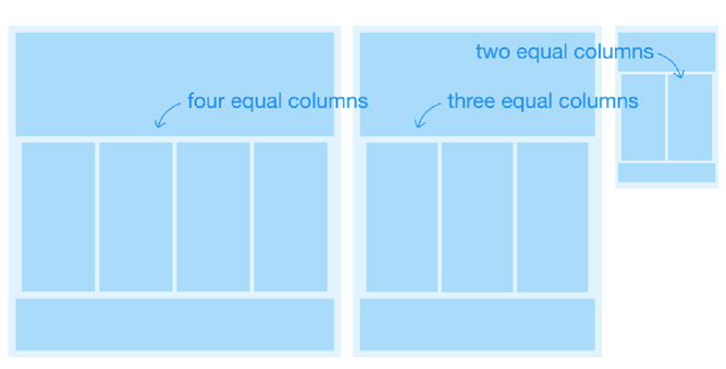
Create the master template
As the web designer, you need to create a master template which will allow you to think about key pointers associated with the responsive website. You can find answers to questions like: How will the components within columns adapt each time the page width gets shrinked? What happens when you have four different columns of content? What happens when you switch to a three-column width? You must ensure to stay in constant touch with the front end developer to understand the right use of components, both in CSS as well as visually.
Work on the site’s Home Page
Have a look at the below original wireframe that’s been created for the website’s home page:
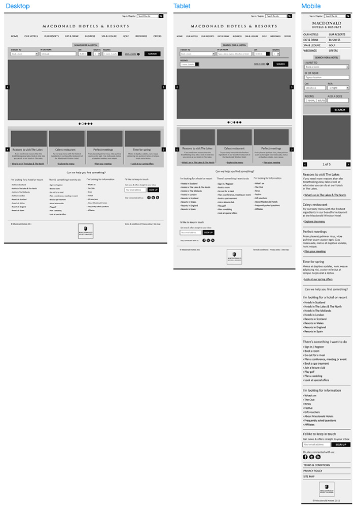
In the above wireframe, you can view that the mobile page length is larger simply because of content wrapping over a single column.
Work on the site’s Main Navigation
For my responsive website, I’ve created a simple horizontal top navigation which includes a fluid width that makes the web pages change in accordance to the screen sizes. With decreasing screen size, the menu items get closer and wrap on to the next line. For the navigation to suit desktops, laptops and tablet widths, I created a menu that was split over two separate columns as shown in below screen-shots:

In addition to above, all the other header components are being aligned towards the right direction and get shifted as and when the page width is decreased. Here, it is important for you to choose a navigation style that would look great when the screen width gets reduced.
Work on the site’s Footer
Well, talking about the website’s footer, it is quite simple. All you need to do is simply analyze the content that needs to be included in the footer and how the same would change, each time the width is changed and the columns get reduced. Have a look at the below screen-shot to view the site’s footer on desktop, tablet and a smartphone:
Key points to consider when building the Mobile Responsive website
While building the site, you need to make a special note of the following pointers:
Use of advanced CSS
You must provoke the client to opt for the use of advanced CSS styles as the same would enable the website to degrade in accordance to the browser’s potential, thereby keeping the site’s load time low.
Keep the image sizes to a minimum
Since the website would be loading all the full size images inspite of CSS scaling them down; it is a good idea to keep the image sizes low. However, you may even opt for using some JavaScript tweaks for making the site run smoothly, even with the heavy images.
Seamless communication with the developer is a must
Responsive website development project can’t go wrong if it is being accompanied by seamless communication between the designer and developer. The concept of discussing issues and solutions at an earlier stage during website development definitely serves as a huge plus point.
Conclusion:
Hope you’d have learned a lot about designing a mobile responsive website in a simple and flexible way. So, get on and create one for your client to woo him/her in no time.
About the Author:
With many years of experience in app development, Amanda is currently working for a leading Mobile application Development Company named Xicom Technologies Ltd If you’re searching for proficient mobile app developers, choosing Amanda will turn to be your best-made decision.