Designers often create website layouts in 2-column or 3-column styles. If you too want to create such a layout, you can choose CSS libraries based on a grid-design that makes the process of creating column style layouts a breeze. But, before using these tools it is important for novice designers to understand how they can create website layouts from the very beginning with the help of HTML/CSS basic code.
Column-centric layouts are usually created in two different forms such as: fixed and fluid. Since we’re living in a mobile dominated era, you must know how you can create a fluid column layout. In this post, I’ll be covering insight on creating a 3-column fluid layout using HTML/CSS.
Introduction
A website layout is generally coded in “percentage-length” or a “relative unit (or em)”. Applying units of percent will render better control over the width of column as well as container.
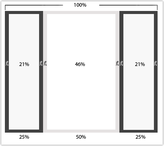
In the above screenshot, you can see that all the dimensions are assigned percentage widths. This will make the layout adjusts according to the screen resolution it is being accessed on. However, the vertical dimensions will stretch according to the height of the main content area.
Ems, on the other hand, is a suitable unit to set padding or font sizes. However, considering the varying modern web needs, making all the columns width fluid isn’t always possible. That’s because, you may need to add some custom elements like logos, images and others in your layout header or sidebar sections. And so, making the column layout fully liquid will force the images to resize, and they’ll appear too small.
A better way to add fluidity into your website layout within a fixed column (ideally your sidebar). Doing so, you can later scale the main content area, according to how the browser window resizes.
Basic 3-Column Layout Structure
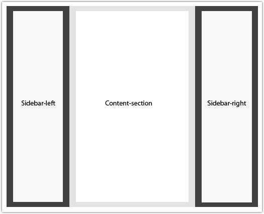
The 3-column layout structure comprises of 4 divs, namely: header, content, sidebar (primary and secondary), and footer.
You can even choose to rearrange the column order in the following ways:
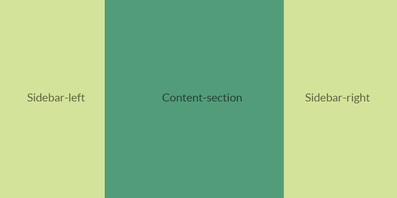
- Sidebar-left, Content-section, Sidebar-right
- Sidebar-right, Content-section, Sidebar-left
- Content-section, Sidebar-right, Sidebar-left
- Sidebar-left, Sidebar-right, Content-section
- Sidebar-right, Sidebar-left, Content-section
- Content-section, Sidebar-left, Sidebar-right
Note: The column will float in the direction according to any one of the above listed order.
The HTML
Let us now look at the basic HTML markup for a 3-column layout:
<div id="wrapper">
    <div id="sidebar-left">
        <p>Sidebar-left</p>
    </div>

    <div id="content-section">
        <p>Content-section</p>
    </div>

    <div id="sidebar-right">
        <p>Sidebar-right</p>
    </div>
</div>
So, now that you have come to know about how to write HTML code for a simple 3-column layout let’s proceed and see an example to understand how you can create a 3-column fluid layout.
Example: Demonstrating How to Create 3 Column Fluid Layout
HTML Source Code:
<div id="wrapper">
<div id="header">This is the header area</div>
<div>
  <div id="sidebar-left">
    <h2>Sidebar Left Section</h2>
    <p>Lorem ipsum....</p>
  </div>
  <div id="content-section">
    <h1>This is the main content section area</h1>
    <p>Lorem ipsum....</p>
  </div>
  <div id="sidebar-right">
    <h2>Sidebar Right Section</h2>
    <p>Lorem ipsum....</p>
  </div>
</div>
<div id="footer">This is the footer area</div>
If you’ll remove the dummy text “Lorem ipsum”, you will find that the above code is just like any basic HTML markup. In the code, we have made the “content div” to appear first, even though it’s not visible on the page. As you may know, a search engine bot crawls a website’s source code and looks for the most important content in the beginning. Since, the sidebar mostly contains static content it is better to place this area at the bottom in the markup.
The CSS:
 body {
  margin: 0;
  padding-left: 0;
}
#header, #footer {
  float: left;
  width: 100%;
}
.row{
  float: left;
  width: 100%;
}
.column {
  float: left;
  padding: 10px 2%;
}
#sidebar-left { width: 21%; }
#sidebar-right { width: 21%; }
#content-section {  width: 46%; }
Wrapping Up!
You can find plenty of solutions when designing website layouts, containing fluid and fixed columns. In fact, web developers often choose the solution that will best suit their needs, after testing different codes. However, this doesn’t mean that one method is better than the other, as you can find contradicting reasons for using different methods.
Hope that the post will help you understand about the basics about creating column centric website layouts. Besides, looking at the example will help you understand the process of creating 3-column fluid layout.
Author Bio: Juana Steves is a web developer by profession and a writer by hobby and works for Xicom Technologies, a software development company. She loves sharing information regarding android application development tips & tricks.