
This is become a trend that every website owner is saying that we are on mobile too and shows their Mobile version website on their smartphone. Responsive web design technique made one website for all screens like Laptop, Desktop, BlackBerry, Android, iPhone, the iPad, netbook, Kindle or any tablet and in coming future we are sure we have to make responsive website for number of new inventions.
[box type=”shadow”]“Basic concept of making website Responsive is to understand the device resolution of your targeted audience”[/box]
Making website Responsive is method that recommends that your designs and developed website should reply to a common user’s behavior and atmosphere built on size of device screen, device orientation and the platform. This is totally depends upon the mixture of flexible grids system, frameworks, markup, images and CSS media queries.
Idea is when user switches from their desktop to tablet or phone, your responsive website should automatically switch to that resolution, and should accommodate images sizes and scripting accordingly. Means your website should have the compatibility to automatically response to the preferences of your audience.
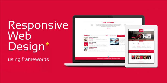
21 Frameworks and Grid System for responsive work
[divider][/divider]
1. Bootstrap – Most wanted and simplex way to responsive
http://twitter.github.com/bootstrap/index.html
2. 1140 CSS Grid
http://cssgrid.net/
3. Semantic Grid System
http://semantic.gs/
4. 320 and Up
http://stuffandnonsense.co.uk/projects/320andup/
5. Golden Grid System
http://goldengridsystem.com/
6. 1KBCSSGrid
http://www.1kbgrid.com/
7. Gridset
http://gridsetapp.com/
8. Fluid Grids
http://fluidgrids.com/
9. Columnal
http://www.columnal.com/
10. Fluid Grid Calculator
http://csswizardry.com/fluid-grids/
11.Skeleton
http://www.getskeleton.com/
12. Variable Grid System
http://grids.heroku.com/
13. LessFramework 4
http://lessframework.com/
14. Tiny Fluid Grid
http://www.tinyfluidgrid.com/
15. Flurid
http://kflorence.github.com/flurid/
16. Gridpak
http://gridpak.com/
17. Susy
http://susy.oddbird.net/
18. Gridless
http://thatcoolguy.github.com/gridless-boilerplate/
19. Inuit.css
http://csswizardry.com/inuitcss/
20. SimpleGrid
http://simplegrid.info/
21. Foundation 5
http://foundation.zurb.com/
Bonus: Online Responsive website testing Tool
Testing of your website is also important factor for making website working fine. Here is the awesome online tool have a look…
http://mattkersley.com/responsive/
Have a cup of coffee on discussion of responsive web design, contact us 🙂