

Considering the current surge in the usage of smartphones for accessing the internet, a large group of business organizations have chosen to promote their products and services via the mobile technology. Hats off to the seamless efforts of mobile app developers, it has become feasible for the entrepreneurs to look out for alternatives to monetize their mobile business applications and corporate websites. If you too are planning to build your very own mobile-friendly website then this is a must-read blog for you. Here, I’ve covered details about developing a mobile-friendly website using some simple-to-follow steps.
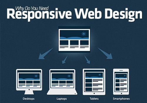
A look at the options available for creating mobile compatible websites

Well, when it comes to the options available for building a mobile-optimized website, there are many, some of which have been mentioned below:
- You can create web page versions that have been optimized for a single cell phone. Thus, you can place a link towards the top of the regular web pages, allowing the user to get redirected to the mobile-optimized website manually.
- You can create mobile-optimized versions of your website for smartphones, which are then automatically detected and managed by the browser.
- You can use the mobile optimized web pages in addition to using a script that can detect the smartphone and upload a specific style for it.
- You can continue the same standard web pages but opt for using a special script that can detect the respective desktop browser and utilize a related style for the website.
Well, the overall structure of a mobile-friendly website includes the following:
- Header
- Breadcrumb
- Page Content
- Sub-Navigation
- Breadcrumb
- Footer
And now, some methods for creating a responsive web design:
Method No.1- Using @media handheld
By including the below mentioned code, your browser will load main.css file for all the internet-enabled devices that are capable of loading your website. After this, the browser will read the inline style that would moderate the font size and width of the file that has already been specified for a wide array of portable devices.
<link rel="stylesheet" type="text/css" href="style.css" media="screen, handheld" />
<link rel="stylesheet" type="text/css" href="another.css" media="screen  and (min-width: 40.5em)" />
<!--[if (lt IE 9)&(!IEMobile)]>
<link rel="stylesheet" type="text/css" href="another.css" />
<![endif]-->
Method No.2- Using the @media screen
Quite similar to the @media handheld method, @media screen comes with only one difference that the specific style is applied to the website only when the screen size of the device gets modified. The below mentioned code is used for changing the font size of the web page along with hiding the sidebar. This behavior is activated once the browser width becomes less than 80px.
Getting acquainted with the best responsive breakpoints is a must Breakpoints, with regards to responsive web design refers to the browser widths that include a media query declaration which is used for changing the site’s layout once the browser falls within the already declared width range. Here, it is also interesting to note that the breakpoints are defined using numeric values and the units of measurement are based on the different media queries that have been entered into the CSS stylesheets. Every responsive website comprises of two breakpoints viz: one for tablets and the other one for mobile gadgets. As a web designer, the count of breakpoints that you need to create primarily depends on the specific traits of your website viz: the layout, techniques that you’ve planned for turning your designs into something truly interactive and many more.
It’s vital to use a script for detecting mobile devices and using CSS style sheet properly
Mentioned below is the script that uses Javascript and offers the site visitors(here, I’m referring to the ones who don’t use the standard web browsers including Chrome, Internet Explorer or Mozilla Firefox) an entirely different CSS style sheet:
<script>// <![CDATA[
if((navigator.userAgent.match(/MSIE/i)) || (navigator.userAgent.match(/Googlebot/i)) || (navigator.userAgent.match(/Chrome/i)) || (navigator.userAgent.match(/Firefox/i))) {""} else {
document.write('<style type="text/css" media="screen">
    #sidebar,#menu{
        display:none;
    }
    #page{
        width:99%;
    }
    #content
        {width:99%;
    }
</style>');}
// ]]></script>
Testing your website for multiple web browsers and mobile devices is hard-to-miss

Once you’re done with creating a fully responsive website, it is essential for you to test your web pages to check their visual appearance and functionality on different portable devices such as smartphones, tablets, netbooks etc. For this, you can use the mobile device simulators that would fetch you 100% accurate and prompt results.
Conclusion
So with that it’s a wrap on this post that comprised of details regarding design and development of mobile-friendly, fully responsive website. Hope by keeping the aforementioned pointers in mind, you’d definitely succeed in developing a website that would stand out from the crowd.
About Author: Emily Heming is an iPhone App Developer for Xicom Technologies Ltd. a leading provider of iPhone development services from where you can also hire dedicated iPhone developer with her best assistance.