Accordion menu is a viable option for website owners who’re pressed for space. In addition, these menus opens a sub-menu when a page loaded, making it convenient for the users to navigate throughout the sub-menu item(s). In this post we’ll talk about the steps involved in creating a Pure CSS3 accordion menu.
Step 1 – HTML Markup
We’ll start by creating a solid frame for our web design. We’ll create an unordered list including an anchor tag and a span tag. In order to style the accordion, we’ll have to use the :target selector on opening the accordion. Just remember to make the target selector work it requires a link pointing to an id. And the id should become the target element when the link is being clicked.
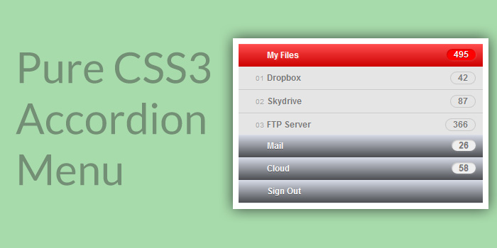
<ul>
<li id="first"><a href="#first">My Files<span>495</span></a></li>
<li id="second"><a href="#second">Mail<span>26</span></a></li>
<li id="third"><a href="#third">Cloud<span>58</span></a></li>
<li id="fourth"><a href="#fourth">Sign Out</a></li>
</ul>
Step 2 – Styling the Menu
In order to clear the margin, padding etc., we will have to add certain reset styles to our menu.
.accordion,
.accordion ul,
.accordion li,
.accordion a,
.accordion span {
margin: 0;

padding: 0;
border: none;
outline: none;
}
.accordion li {
list-style: none;
}
Next, we’ll style the menu links, by adding a CSS3 gradient, drop shadows and some more basic font styles. Keep in mind that the menu won’t have fixed width and will take out the complete parent width instead. And so, for assigning the menu with the width you want, simply create a div and give it your choice of width.
.accordion li > a {
display: block;
position: relative;
min-width: 110px;
padding: 0 10px 0 40px;
color: #fbfbfb;
font: bold 12px/32px Arial, sans-serif;
text-decoration: none;
text-shadow: 0px 1px 0px rgba(0,0,0, .35);
background: #d8dce8;
background: -moz-linear-gradient(top,  #d8dce8 0%, #4b4d51 100%);
background: -webkit-gradient(linear, left top, left bottom, color-stop(0%,#d8dce8), color-stop(100%,#4b4d51));
background: -webkit-linear-gradient(top,  #d8dce8 0%,#4b4d51 100%);
background: -o-linear-gradient(top,  #d8dce8 0%,#4b4d51 100%);
background: -ms-linear-gradient(top,  #d8dce8 0%,#4b4d51 100%);
background: linear-gradient(top,  #d8dce8 0%,#4b4d51 100%);
-webkit-box-shadow: inset 0px 1px 0px 0px rgba(255,255,255, .1), 0px 1px 0px 0px rgba(0,0,0, .1);
-moz-box-shadow: inset 0px 1px 0px 0px rgba(255,255,255, .1), 0px 1px 0px 0px rgba(0,0,0, .1);
box-shadow: inset 0px 1px 0px 0px rgba(255,255,255, .1), 0px 1px 0px 0px rgba(0,0,0, .1);
}
What’s more? For styling the span we’ll give it a very light-gray background color and shadows.
.accordion li > a span {
display: block;
position: absolute;
color: #777;
top: 7px;
right: 0;
padding: 0 10px;
margin-right: 10px;
font: normal bold 12px/16px Arial, sans-serif;
background: #efefef;
-webkit-border-radius: 15px;
-moz-border-radius: 15px;
border-radius: 15px;
-webkit-box-shadow: inset 1px 1px 1px rgba(0,0,0, .2), 1px 1px 1px rgba(255,255,255, .1);
-moz-box-shadow: inset 1px 1px 1px rgba(0,0,0, .2), 1px 1px 1px rgba(255,255,255, .1);
box-shadow: inset 1px 1px 1px rgba(0,0,0, .2), 1px 1px 1px rgba(255,255,255, .1);
}
Step 3 – Inserting Icons
For this step we’ll use the :before selector. It will help in inserting the content prior to the element we’ve chosen.
.accordion > li > a:before {
position: absolute;
top: 0;
left: 0;
content: ' ';
width: 24px;
height: 24px;
margin: 4px 8px;
background-repeat: no-repeat;
background-image: url(../img/new-icons.png);
background-position: 0px 0px;
}
In the above example, as you can see we’ve created a sprite image, which includes all the icons. Using sprites proves advantageous, as it helps in loading all the icons simultaneously.
.accordion li.files > a:before { background-position: 0px 0px; }
.accordion li.files:hover > a:before,
.accordion li.files:target > a:before { background-position: 0px -24px; }

.accordion li.mail > a:before { background-position: -24px 0px; }
.accordion li.mail:hover > a:before,
.accordion li.mail:target > a:before { background-position: -24px -24px; }

.accordion li.cloud > a:before { background-position: -48px 0px; }
.accordion li.cloud:hover > a:before,
.accordion li.cloud:target > a:before { background-position: -48px -24px; }

.accordion li.sign > a:before { background-position: -72px 0px; }
.accordion li.sign:hover > a:before,
.accordion li.sign:target > a:before { background-position: -72px -24px; }
Step 4 – Sub Menu Links
In case you want to create sub-menus, on the main menu we’ll have to add another unordered list along with the sub-menu class.
<li id="first"><a href="#first">My Files<span>495</span></a>
<ul>
<li><a href="#"><em>01</em>Dropbox<span>42</span></a></li>
<li><a href="#"><em>02</em>Skydrive<span>87</span></a></li>
<li><a href="#"><em>03</em>FTP Server<span>366</span></a></li>
</ul>
</li>
The sub-menu links have same styles and we’ll make changes to the colors, shadows, etc.
.sub-menu li a {
color: #797979;
text-shadow: 1px 1px 0px rgba(255,255,255, .2);
background: #e5e5e5;
border-bottom: 1px solid #c9c9c9;
-webkit-box-shadow: inset 0px 1px 0px 0px rgba(255,255,255, .1), 0px 1px 0px 0px rgba(0,0,0, .1);
-moz-box-shadow: inset 0px 1px 0px 0px rgba(255,255,255, .1), 0px 1px 0px 0px rgba(0,0,0, .1);
box-shadow: inset 0px 1px 0px 0px rgba(255,255,255, .1), 0px 1px 0px 0px rgba(0,0,0, .1);
}
.sub-menu li:last-child a { border: none; }
.sub-menu li > a span {
color: #797979;
text-shadow: 1px 1px 0px rgba(255,255,255, .2);
background: transparent;
border: 1px solid #c9c9c9;
-webkit-box-shadow: none;
-moz-box-shadow: none;
box-shadow: none;
}
.sub-menu em {
position: absolute;
top: 0;
margin-left: -16px;
color: #a6a6a6;
font: normal 10px/32px Arial, sans-serif;
}
Step 5 – Changing the Hover and Active States of Sub Menu
You would want to change the color of sub-menu when it is hovered. In our case, we’ll change the gradient to a red one. In addition, we will also change the span style to red. And change the background color of the sub-menu hover state to gray.
.accordion > li:hover > a,
.accordion > li:target > a {
text-shadow: 1px 1px 1px rgba(255,255,255, .2);
/*background: url(../img/active.png) repeat-x;*/
background: #ff4d4d;
background: -moz-linear-gradient(top,  #ff4d4d 0%, #cc0000 100%);
background: -webkit-gradient(linear, left top, left bottom, color-stop(0%,#ff4d4d), color-stop(100%,#cc0000));
background: -webkit-linear-gradient(top, #ff4d4d 0%,#cc0000 100%);
background: -o-linear-gradient(top,  #ff4d4d 0%,#cc0000 100%);
background: -ms-linear-gradient(top,  #ff4d4d 0%,#cc0000 100%);
background: linear-gradient(top,  #ff4d4d 0%,#cc0000 100%);
}
.accordion > li:hover > a span,
.accordion > li:target > a span {
color: #fdfdfd;
text-shadow: 0px 1px 0px rgba(0,0,0, .35);
background: #ff0000;
}
.sub-menu li:hover a { background: #808080; }
Step 6 – Displaying and Hiding the Sub Menu
In order to hide the sub-menu we’ll assign its height. Additionally, we will also add a slide transition effect to it. In our example, we’re assigning the sub-menu 96px height. In case, you want to make the sub menu automatic give 100% value to the height (but in this case the slide effect won’t work).
.accordion li > .sub-menu {
height: 0;
overflow: hidden;
-webkit-transition: all .2s ease-in-out;
-moz-transition: all .2s ease-in-out;
-o-transition: all .2s ease-in-out;
-ms-transition: all .2s ease-in-out;
transition: all .2s ease-in-out;
}
.accordion li:target > .sub-menu {
height: 96px;
}
That’s it, following the aforementioned steps will hopefully help you create a Pure CSS3 Accordion Menu in the most efficient way possible.
Demo and Download the code snippets
Author Bio – Sarah Parker is an experienced HTML to WordPress service provider, and a web designer. With this article, she is making people aware about building a pure CSS3 accordion Menu.